
In classic SaaS, the workflow is predefined: the user follows the steps, fills in the fields, and the system responds. AI agents flip this scenario entirely. Users set a goal, and the system decides how to get the job done.
This changes how we design interfaces. Instead of mapping out every possible scenario in advance, we need to design for systems that can interpret intent, make decisions, and act.
I’m Dmytro, a UX designer at Habitat, and I study and design AI-native products. In this article, I’ll share my experience and some AI agent design best practices I use in my work.
AI agent interfaces differ from SaaS in almost every way
In traditional SaaS, the product team designs the workflow in advance. Users enter parameters, follow predefined steps, and get a result.
Think of Airbnb: you select dates, choose the number of guests, review the listing, and confirm. Every step is already mapped.
AI agents work differently. Users describe what they want to achieve, and the system decides which tools to use and in what order. Instead of filling forms, you might say “Prepare a weekly update for the board” or “Find the biggest risk in this quarter’s numbers,” and the agent figures out the rest.
This shift changes what an interface looks like. An AI agent doesn’t have to be a chatbot. Depending on the task, it might appear as:
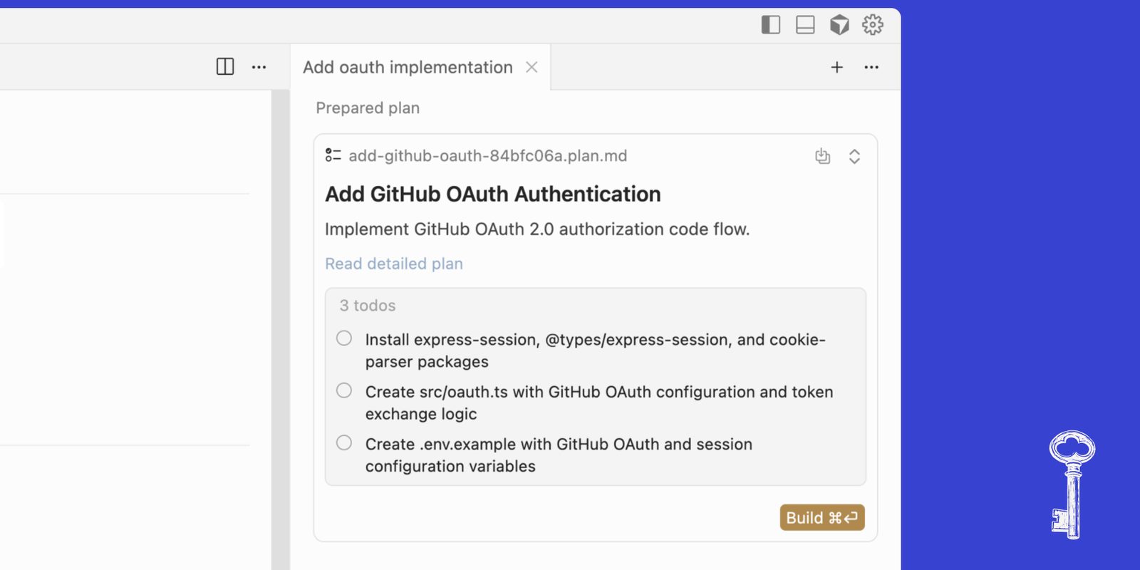
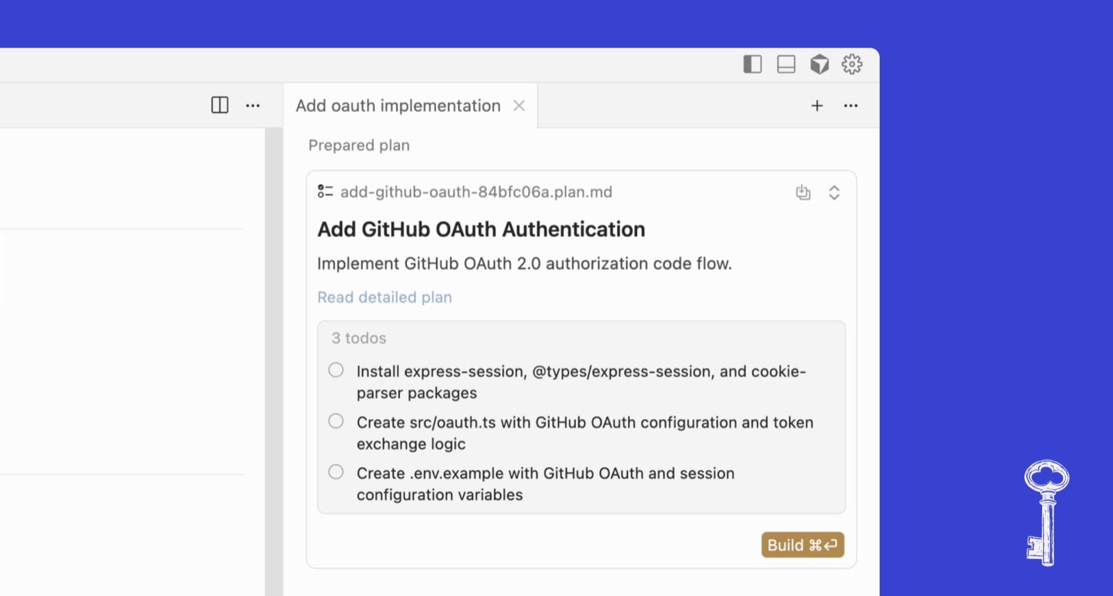
- Cursor Plan Mode — a visual, editable plan that the agent creates before writing any code. You review the steps, change them, then hit Build.
- Notion AI — actions appear directly on selected text (summarise, translate, change tone). No separate AI mode required.

- ChatGPT or Claude agent modes — permission settings that let users choose how much freedom the system has.

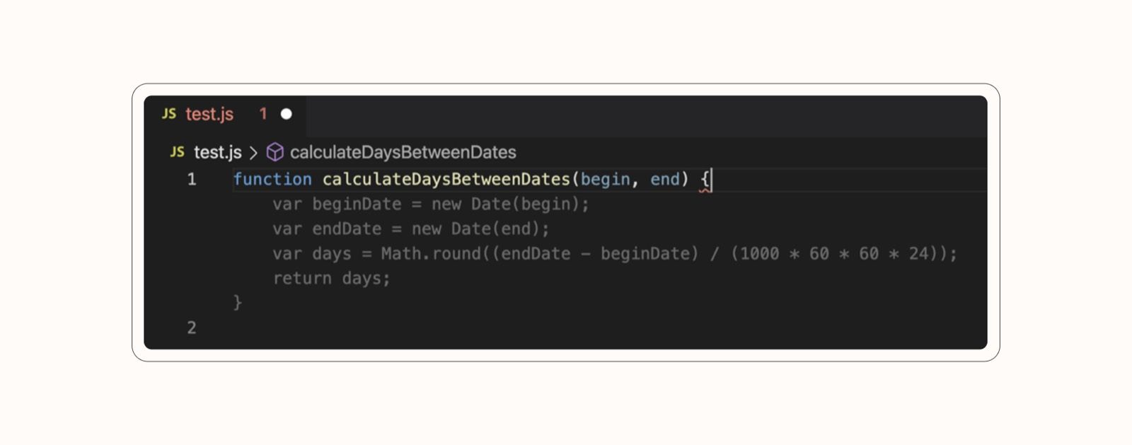
- GitHub Copilot — inline code suggestions that appear while you type, right in the editor.
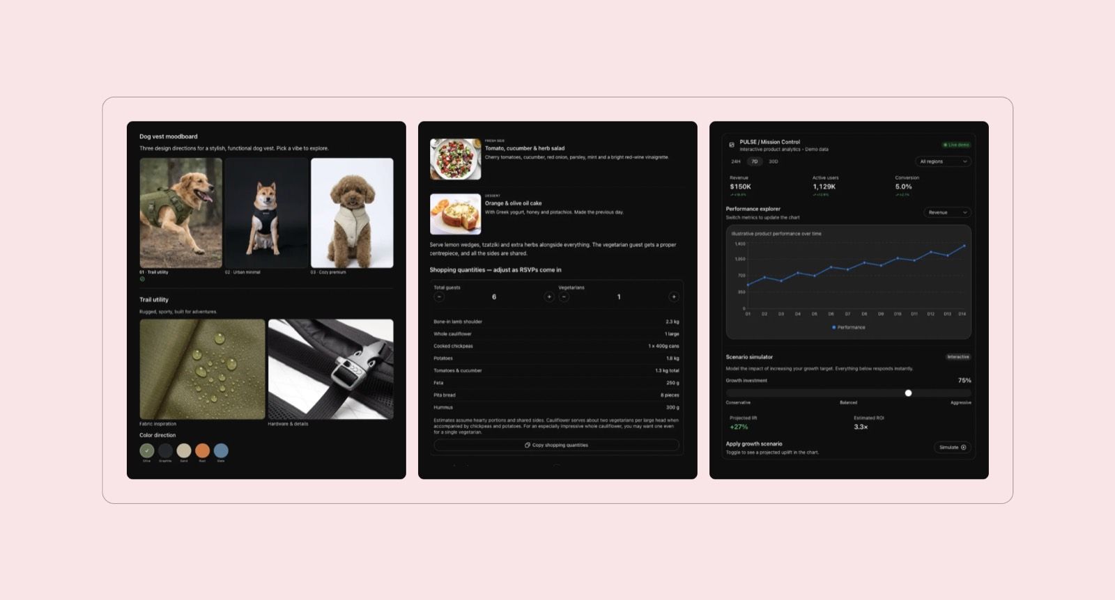
With intelligent UI, AI can even generate interface components on demand, adapting the experience to the task.
With ChatGPT’s Intelligent UI, when you ask for something visual or interactive, it can generate custom elements right in the response — an interactive calculator with sliders, a seat map you can click, or a diagram with expandable parts, instead of plain text.
The fundamental change is that we’re no longer designing every possible user journey in advance. We’re designing how people interact with systems that can interpret intent, make decisions, and take action.
I apply 4 core principles for designing AI-native and agentic interfaces.
4 core principles of AI agent interface design
An AI agent can make decisions and complete tasks on its own, but that doesn't mean users should be left wondering what's happening behind the scenes. In my experience, the best agentic interfaces make an agent’s actions understandable, give users reasons to trust it, and leave room for human intervention.
At Habitat, we apply 4 principles for designing agentic experiences: Explainability, Trust, Control, and Failure Design. Together, they shape how users interact with an agent at every stage:
- Understanding the agent’s decisions
- Checking its work
- Steering its behavior
- Getting back on track when something goes wrong

Here’s how I approach each principle in practice, along with the interface patterns.
1. Explain what the agent is doing
When an AI agent takes on a task, users need to understand what's happening behind the scenes. Otherwise, they have no way of knowing whether it's making progress, waiting for input, or heading in the wrong direction.
I wouldn't show every technical detail by default, as that can overwhelm users. The trick is to match the level of detail to the task’s complexity.
For a simple request, showing the current step, what's already completed, and whether the agent needs anything from the user is enough. For more involved tasks, I'd expose the execution steps, the sources being used, and the results returned by external tools.
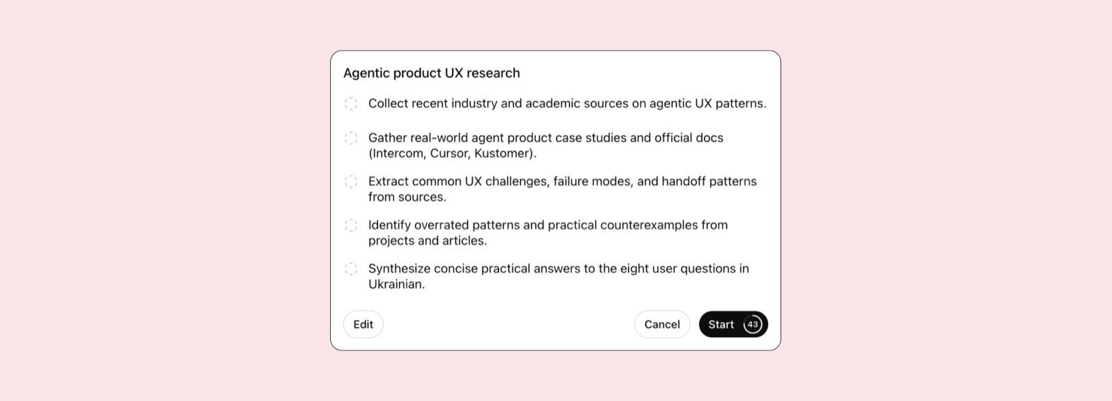
For complex tasks, I'd go one step further and show the execution plan before the agent starts. Ideally, users should be able to edit the plan or execute it step by step. For example:
I apply this in my work, too. In Adair, a research tool we designed for public companies preparing earnings calls, users work with company data, external sources, and uploaded documents. Drafting scripts takes time, so I added specific status messages, such as “Generating a draft of your script,” to keep users informed about what the system is doing.


Get the week’s best stories
2. Provide evidence
AI can produce a polished answer and still get the facts wrong. We shouldn't design interfaces as if a confident answer was a correct one.
I believe trust should come from things users can verify. Show the sources behind an answer, make important figures traceable, and be upfront about what the system can and cannot do. If something needs human verification, say so. Don't hide uncertainty behind reassuring messages.
This was especially important when we worked on Adair, an AI research agent that helps public companies understand their market position ahead of earnings calls. In this context, getting the data right is critical. Even a small inaccuracy can undermine investors’ trust in the company. Users need to know not only what the AI found, but also where the information comes from and whether the conclusions are backed by evidence. That’s why we made sources and supporting data visible throughout.
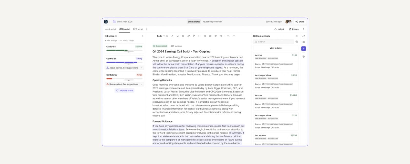
I'd apply the same thinking to any AI product. If the system makes a recommendation, show what it's based on. If it changes something, make the change visible. And if it can't verify a claim, don't present it as an established fact.
3. Give users control, but don't make them manage everything
There are two extremes I try to avoid when designing agentic interfaces. At one end, the system acts without asking, even when the consequences are significant. At the other, it asks for permission at every step, turning the user into a full-time supervisor. Neither makes much sense.
I'd determine how much freedom an agent gets based on the risk of the action and how easy it is to reverse. Gathering information, analyzing documents, or preparing a draft can happen without constant approval. Sending that draft to a client is a different story.
This is often called progressive autonomy: the system gets more freedom where it's safe, while users retain approval controls for actions that require human judgment. The more serious the consequences and the harder an action is to undo, the more important human approval becomes.
In Adair, users don't have to regenerate an entire earnings-call script just to change one section. They can request a revision to a specific part. While the agent works on it, an inline status indicator appears with a stop button. If the revision starts going in the wrong direction, users can stop it without interrupting the rest of the script.
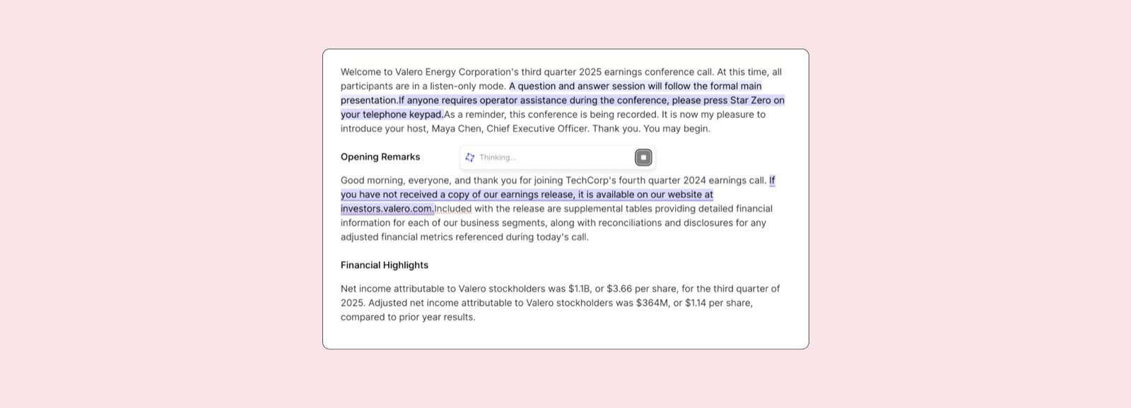
My takeaway is that autonomy isn't an all-or-nothing setting. Give users room to delegate, but never make it difficult for them to step in.
4. Design the way back before something goes wrong
A lot of AI interfaces are designed around the perfect scenario: the agent understands the request, completes the task, and returns what the user wanted. But that's not how the agents work in real life.
Requests can be ambiguous, or information can be missing. Sometimes the agent completes three steps and fails on the fourth.
I'd design these situations just as carefully as the main workflow. A generic "Something went wrong" message isn't enough. Users need to understand what happened and what they can do next.
For example:
- Ambiguous intent: ask a focused question or offer options to clarify the request.
- Missing information: explain exactly which data the agent needs to continue.
- Permission denied: tell users which access is missing and how to grant it.
- Tool unavailable: offer a retry, an alternative, or a handoff to a person.
- Partial completion: distinguish between completed and unfinished steps.
- Timeout: show the current task status and offer safe next actions.
This is a pattern worth borrowing from tools like Cursor. When an AI agent makes code changes, users can review the diff, navigate between modified files, and accept or reject the proposed changes. Checkpoints also let them restore an earlier state if something goes wrong.
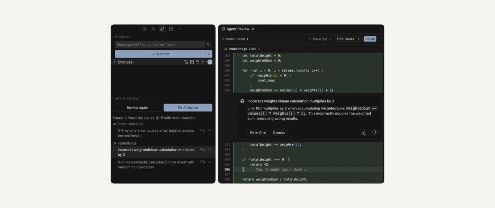
A failed task shouldn't mean lost progress or starting from scratch. Always give users a clear explanation and a way forward.
Before you add AI, ask what the user needs
There's one piece of advice I'd put ahead of all 4 principles: don't start with AI.
It's easy to hear about a new model or capability and immediately look for a place to add it. But that's how products end up with features that look impressive in a demo and feel awkward in everyday use.
I prefer what we call an AI-secondary mindset. Start by understanding the user's problem, how they solve it today, and where the process creates unnecessary work. Only then decide whether AI can make that experience better.
That's how I'd approach AI features in general: don't create a separate AI experience just because you can. Put the capability where it helps people do what they need.
Ultimately, users aren't particularly interested in whether a feature runs on an AI model, an API, or a traditional algorithm. They want their problem solved.
The takeaway: don't design for perfect AI
AI will make mistakes. People will need to review its work, correct it, and sometimes take over. A good interface doesn't pretend otherwise.
At Habitat, we're designing AI-powered products and exploring how people can work with increasingly capable systems without losing sight of what they're doing. If you're building an AI product and figuring out how to approach these questions, let’s get in touch. We'd be happy to share our experience and discuss what might work for your product.