.png)


AI product design isn't sunshine and rainbows. Why startups fail design badly (and how to fix it)

Building a strong AI product takes two things: the technology that powers it and a design layer that makes it work for humans. The market has the first in abundance. As for the second? Let’s just say it’s not all sunshine and rainbows. Take it from Y Combinator partners who have watched more AI startups fail than the founding teams will ever admit: the differentiator of AI products is always about understanding the human on the other end.
In this article, I break down why this happens, and how to fix it before user adoption suffers.
TL;DR
- Most founding teams overfocus on the technical side of their AI product and underestimate the “human” side.
- This happens by default. The deeper you go on the technical side, the harder it becomes to see your product the way a confused user sees it.
- Four dimensions where AI product design slips up: Explainability, Trust signals, Control, Failure design.
Bad design costs more in AI than any other software category
Every technology wave produces the same pattern. You build something powerful, it looks impressive, and then it fails the humans it was supposed to help.
AI is no different, except the cost of that stumble is higher.
With regular software, bad design frustrates users. With AI, it can destroy their trust in the product itself. Unlike regular software that crashes visibly when something goes wrong, AI can return a confident answer regardless. Right or wrong, it looks the same, and the user has no way to tell the difference.
It happens because AI product design became its own category that surfaces a different set of considerations. Rachel Been, SVP of Design at Expedia, frames the core challenge: how do you design for a user who can't see what the AI is doing? How do you help them understand how and when to trust it?
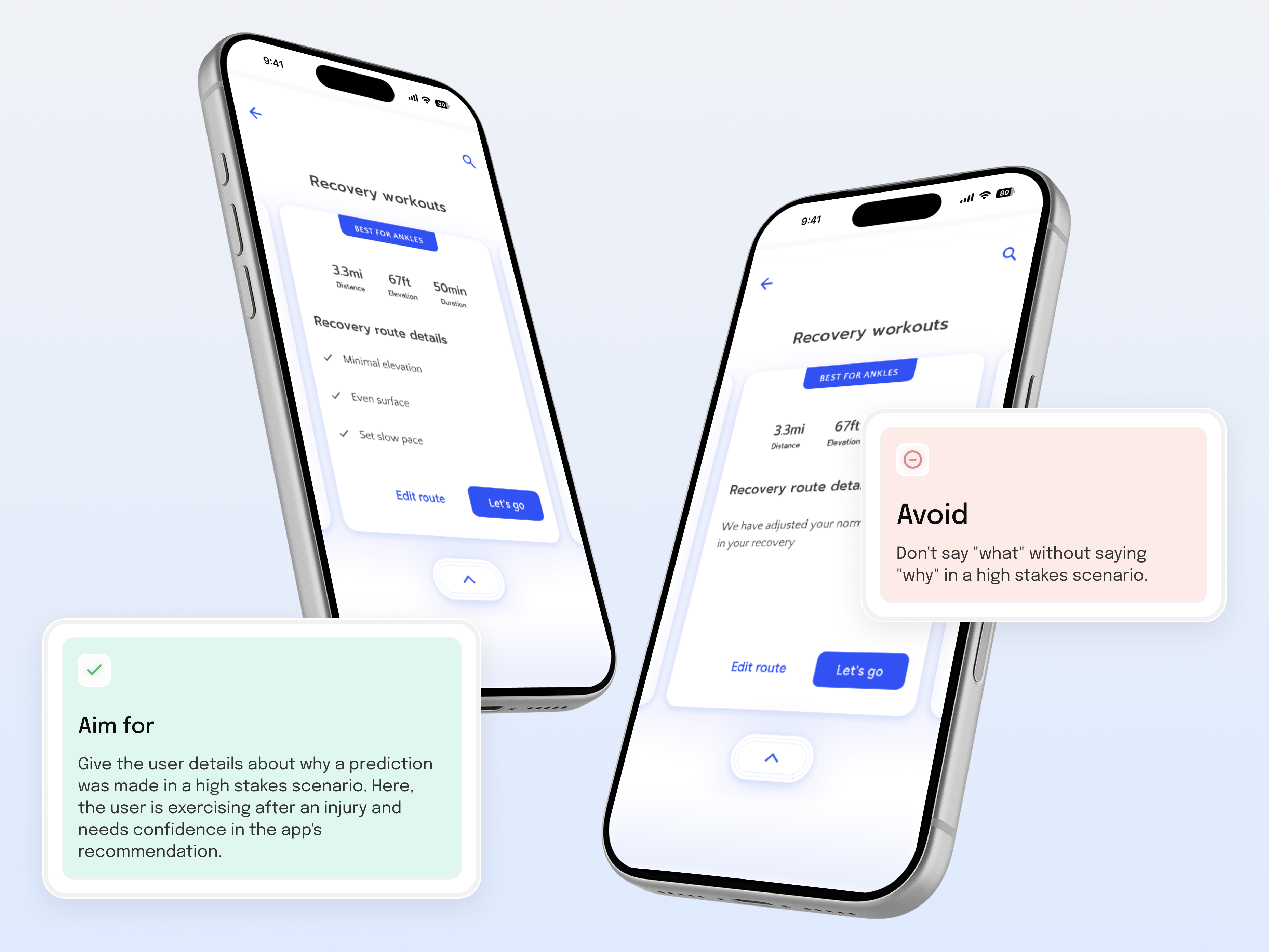
The interface has to make the user confident enough to act on what the AI tells them, and that's what AI-native design is for. In most AI startups I've seen, it's the last thing that gets built.
Why AI startup founders underinvest in the human layer
Truth is, it often happens by default when the technical side takes over. And it makes sense: you're focused on shipping something that works. But a product that works technically doesn't guarantee users will adopt it.
The founding teams that build AI products people use tend to share something. Garry Tan, CEO of Y Combinator, calls it the polymath skill set:
- Deep technical expertise on one side,
- And the human understanding to translate it on the other.
%20(1).png)
That combination is genuinely rare in a single person or team that’s focused on the technical side. The deeper you go on it, the harder it becomes to see your product the way a confused user sees it. The human layer gets crowded out as the technical work takes over. “We'll deal with it later” feels like a reasonable call.
Bad news: the longer you wait, the more your users adapt to the broken version. Good news: now that AI products have been around for some time, the failure patterns in AI product design are becoming clear.
is the first step to fixing them, whether you tackle it in-house or bring in one of the AI product design agencies in your corner.
4 failure modes of AI products and how to address each
AI products have a specific failure pattern that standard UX thinking wasn't built for. Standard UX assumes a deterministic interface, meaning the same input produces the same output. On the other hand, AI can give different answers to the same question, and sometimes, those answers are wrong. Users know this, even if they can't articulate it. That's why AI product design is about trust first.
At Habitat, we look at this through what we call the AI Feature Design Fit framework. It's a diagnostic that checks whether an AI feature works for the humans using it.
.png)
It considers four things:
- Explainability: does the user understand what the AI is doing and why?
- Control: can the user override, adjust, or ignore the AI?
- Trust signals: does the UI build confidence in AI accuracy?
- Failure design: what does the AI do when it's wrong or uncertain?
.png)
Failure mode 1: Explainability. When users don’t understand what the AI just did
The user got an answer but doesn't know where it came from. So they can't decide whether to trust it or act on it. This is what explainability failure looks like in practice. Think a doctor gets a diagnosis recommendation with no clinical rationale. Or a founder gets a market sizing with no methodology shown.
%20(1).png)
This doesn’t mean you should go all in on technical explanations of the model. Users just need enough context to evaluate the result. Öznur Özkurt, a Design Lead, ran into this building AI diagnostic tools for clinicians:
“People don't necessarily need to understand the math behind the algorithm to trust it. The algorithm can show the user what it's thinking by outlining what it sees.”
Gumloop, a workflow automation tool, takes this further for agentic products. Its canvas interface shows the user every step the agent will take. Before anything runs, a plain-English breakdown explains exactly what each step does: get the keywords, scrape the content, suggest optimizations, output to Google Doc. The process is legible before execution begins.
%20(1).png)
The principle applies whether you're building an agent or any other AI product: show the user what the AI is doing, not just what it decided.
Failure mode 2: Trust signals. When users see the result but won't act on it
This is when the interface shows an output but gives the user nothing to anchor their confidence. No source, no indication of where the result came from, and no way to verify it. So they second-guess or skip it.
The fix is showing the user where the output came from, in one click. The pattern was popularised by Perplexity: numbered inline citations attached to each claim, so the user can trace any answer back to its source in one click.
Prospecting tool AnswerGrid applies the same logic. Every cell in their tables has a source attached, showing exactly where that data point came from.
.png)
Another example is AI notepad Granola that expands on your raw meeting notes. Every AI-generated summary point has a magnifying glass next to it. If you click it, a popover shows the exact transcript excerpt that generated that note.
%20(1).png)
No matter the product, the Trust Signal principle is universal: show the source close to the output.
Failure mode 3: Control. When the AI decided, but the user has no exit
This is when there’s no way to adjust, override, or even ignore what AI did. Over time, that feeling of being locked out erodes trust faster than any wrong answer.
The fix is designing control into the product as a core interaction principle. Let’s take Argil, an AI video generation tool, which builds it into the video generation process itself. Creating a realistic video from a script takes around 12 minutes to render. Instead of making the user wait and discover something is wrong at the end, Argil shows a blurry preview with audio immediately. Only once the user confirms it does the full generation run.
%20(1).png)
In Granola AI, the user takes their own notes during the meeting, and the AI enhances them after. Both versions sit side by side, and the user can edit the enhanced version, return to their raw notes, or re-enhance from scratch.
%20(1).png)
Both products solve the Control dimension differently, but the point is the same: the user should never feel stuck with what the AI decided.
Failure mode 4: Failure design. When AI fails, and the interface says nothing
Most AI products are designed for when things go right. Failure design means thinking about what happens when things go wrong (and boy, do they go wrong in AI products).
.png)
Failure design comes up in three specific moments:
- When the AI is uncertain
- When the data is incomplete
- When the user rejects the output
The last one is also a feedback loop question: if the user says no, does the product learn from it? Most don't. They generate the same kind of output next time and wonder why engagement drops.
The incomplete data case is the easiest to see. The AI can't do its job yet because it doesn't have enough input. Without a failure design, the app can just show an error. With it, it’ll tell you what's missing and how to fix it. For better context, take a look at Google’s example.
.png)
So both versions know the data is missing. But in the first case, the interface tells the user what to do about it.
Recap. Four failure modes mapped via AI Feature Design Fit Framework
Every AI interaction has four moments where design either works or doesn't. The AI Feature Design Fit is the diagnostic for each one:
- The AI produces output → Explainability: can the user read what happened?
- The user reads it → Trust signals: does the user believe it?
- The user believes it (mostly) → Control: can the user shape or reject it?
- The AI gets it wrong → Failure design: does the product handle the breakdown?
Each of those moments has a failure mode:
.png)
Why "fix it later" is the most expensive decision in AI product development
"We'll fix it later" feels reasonable when early users aren't complaining. They have low expectations and no ingrained habits yet, so the gaps are invisible to them.
But invisible doesn't mean harmless. Every interaction without explainability teaches users that your product is tricky to understand. Every interaction without control teaches them the AI's decisions are final and lessens their trust. By the time you fix it, you're redesigning against habits the product itself created.
The four failure modes I highlighted are diagnosable.
A good place to start: check for and fix them with Habitat’s free [[48-hour product audit.]]
We'll go through your AI product and come back with specific observations on where the human layer is breaking down. The kind you’d normally pay for, absolutely free.